

Johnney B Design – Brand Identity Redesign
This project reimagines the “Johnney B Design” brand from a decorative, script-based logo into a bold, modular identity system tailored for the custom goalie mask industry. The original design relied on flowing hand-lettered forms that, while expressive, lacked clarity, structure, and adaptability across formats like merchandise, decals, or digital use.
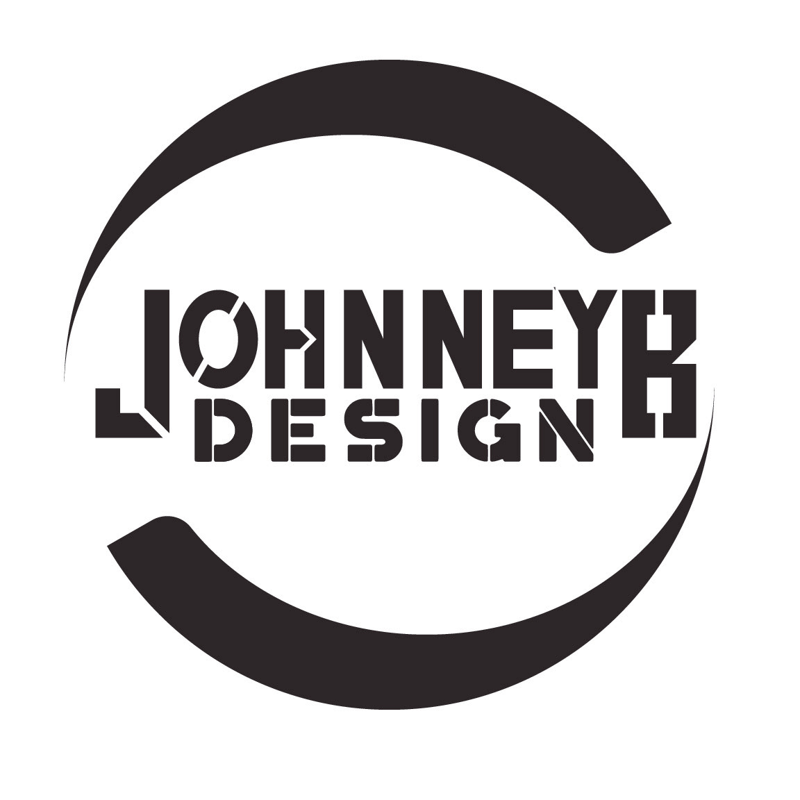
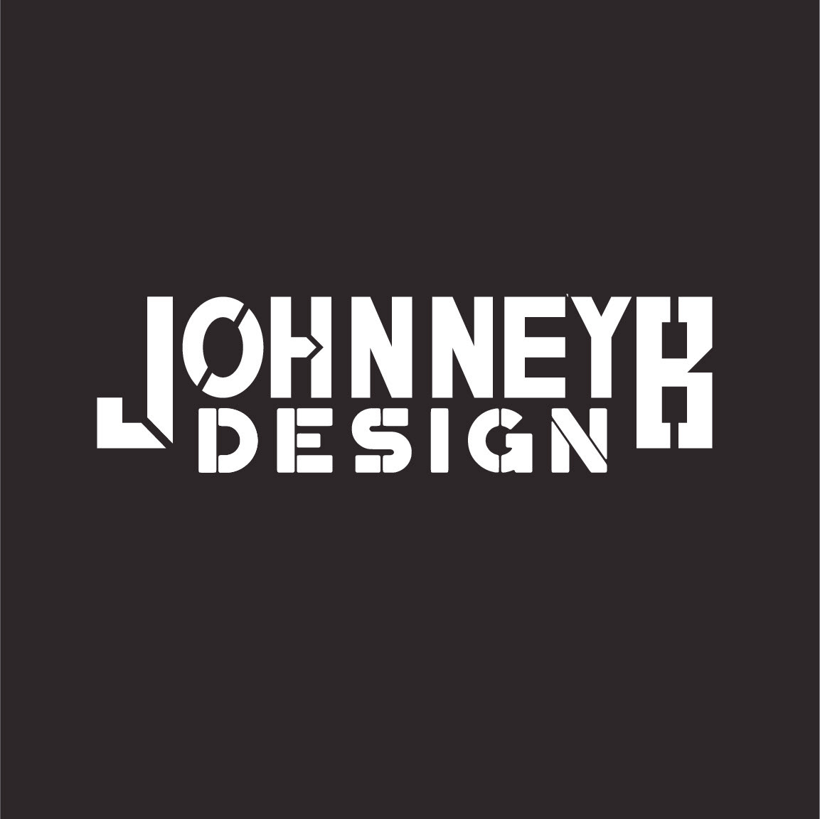
The redesigned identity focuses on controlled geometry and stencil-inspired cuts to convey craftsmanship, precision, and grit. The custom typography introduces industrial shapes and angular breaks, referencing both the physical construction of goalie masks and the sharp focus required in mask painting. A sweeping circular stamp—used across full wordmarks and monograms—echoes puck motion and gear curves, reinforcing the brand’s niche without overcomplication.
With multiple variations, from the full "JOHNNEY B DESIGN" to the standalone "JB" mark, this new system delivers flexibility, clarity, and a strong sense of brand purpose. It shifts the tone from ornamental to operational—ready for helmets, social branding, apparel, and pro-grade client work.